Kora
A clothing store app for handloom and cotton wear, from the new season to order placed.
An app design for a fictional brand — not client work. The people, prices and bookings on its screens are invented.
- Scope
- App flow · UI design · 7 screens
- Platform
- Mobile app · iPhone, 390 × 844
- Year
- 2026
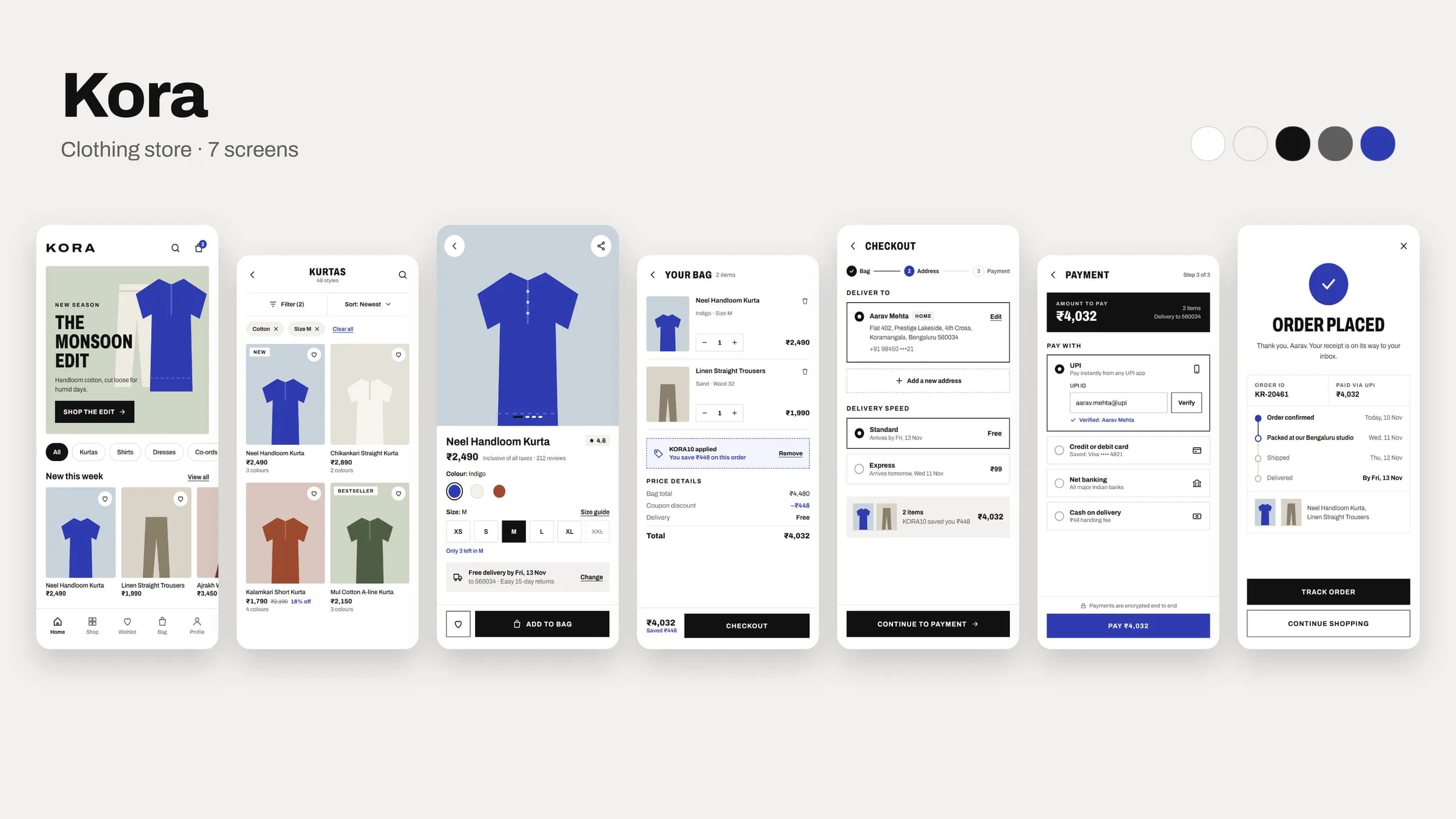
The app, screen by screen
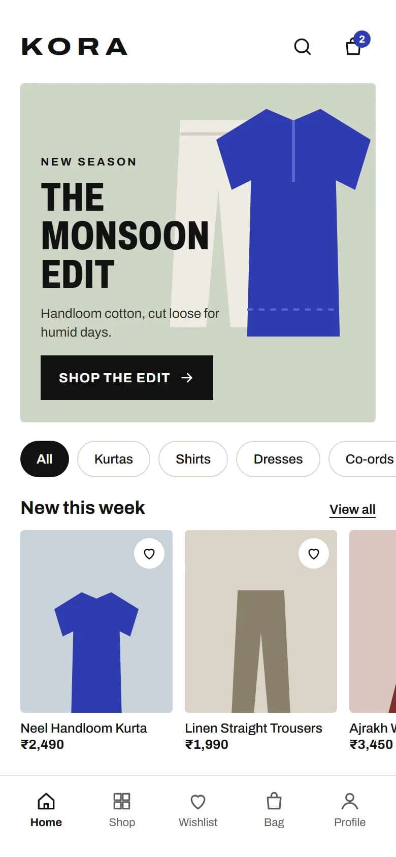
01Home 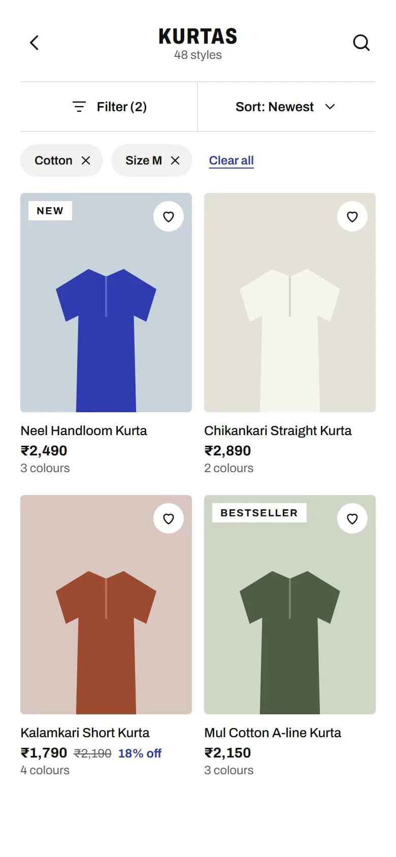
02Category 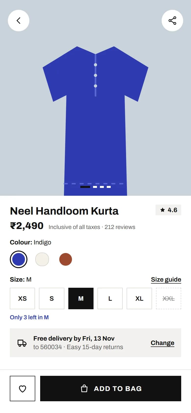
03Product 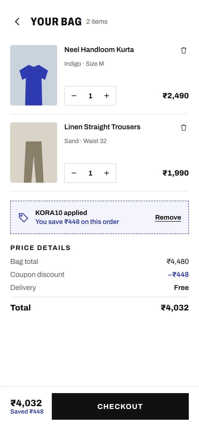
04Bag 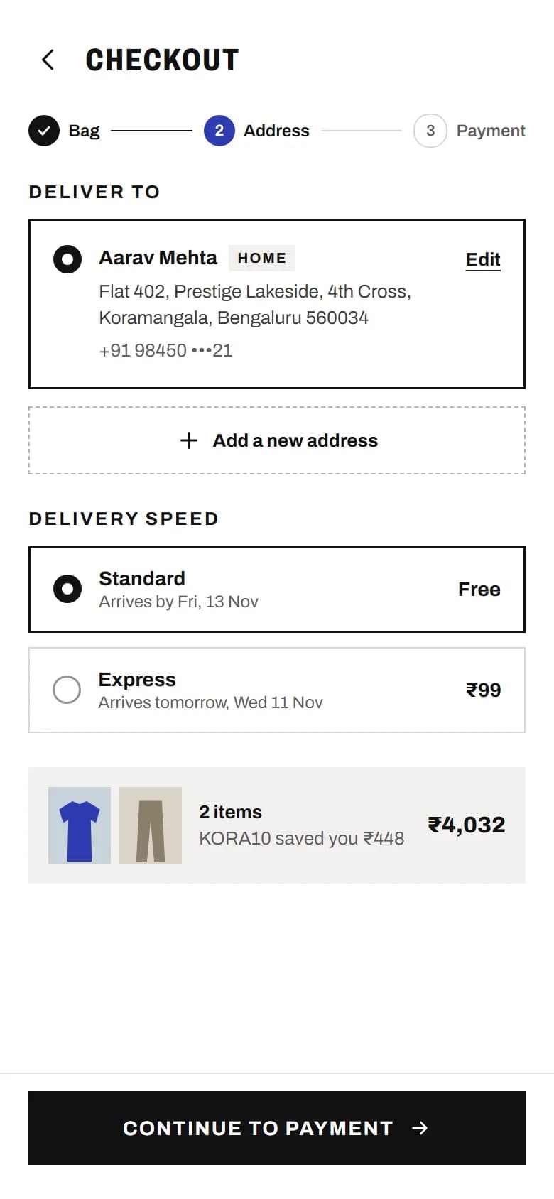
05Address and delivery 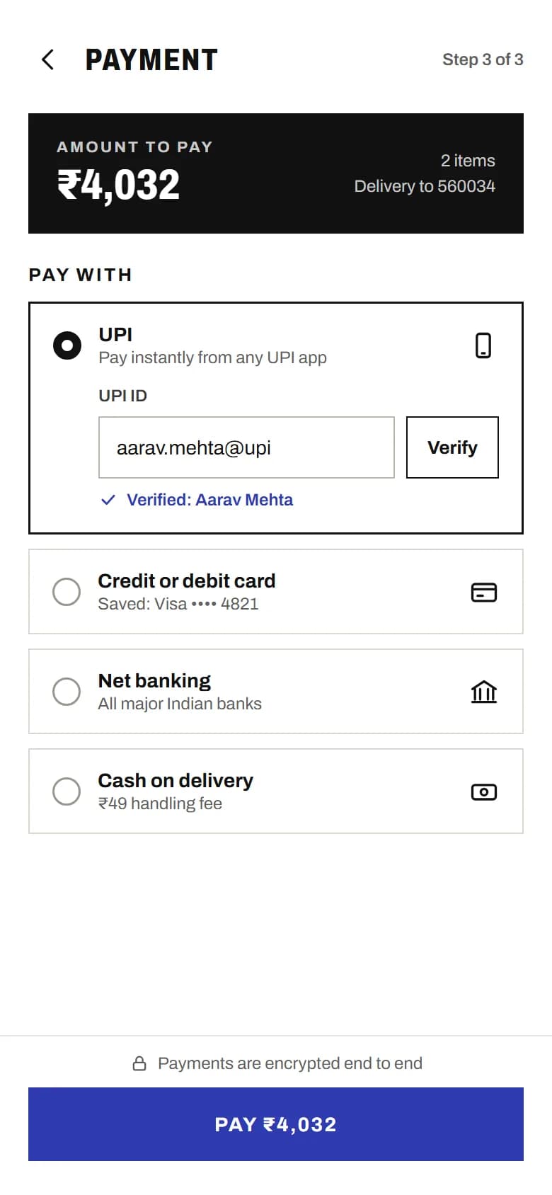
06Payment 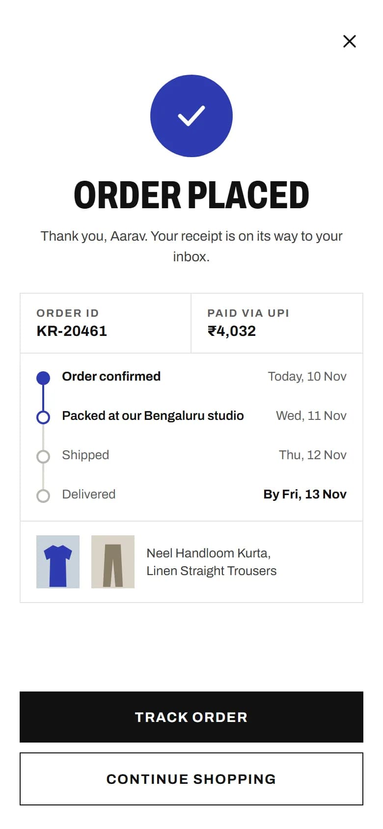
07Order placed
Flow · Home → Category → Product → Bag → Address and delivery → Payment → Order placed
The idea
An app design for a fictional handloom label: can a store look like a fashion print magazine and still take a shopper from browsing to paid without a moment of doubt?
Our approach
White space, black type and one indigo accent, kept for prices, offers and the pay button. Seven screens take the shopper from home through a category, a product and the bag to address, payment and the order confirmation, and the money adds up throughout: a ₹4,480 bag less the 10% coupon is ₹4,032 on every screen that shows it.
Key decisions
Sizes that tell the truth
A sold-out size shows dashed and struck through, and the selector warns when stock in the chosen size is low, before the shopper commits.
The coupon, already applied
The bag shows the coupon applied, with the saving in rupees, rather than an empty code field.
Always know how far is left
A three-step indicator (Bag, Address, Payment) runs through checkout. UPI is the default, with the UPI ID verified before paying.
Palette and type
- Ground#FFFFFF · Screen background
- Surface#F2F1EE · Panels, chips, delivery strip
- Ink#111111 · Type, primary buttons
- Muted text#5E5E5E · Secondary text
- Accent#2E3BB0 · Offers, badges, pay button
Type · Archivo