Safarnama
A travel packages app for India, from picking a Kerala trip to a paid deposit.
An app design for a fictional brand — not client work. The people, prices and bookings on its screens are invented.
- Scope
- App flow · UI design · 7 screens
- Platform
- Mobile app · iPhone, 390 × 844
- Year
- 2026
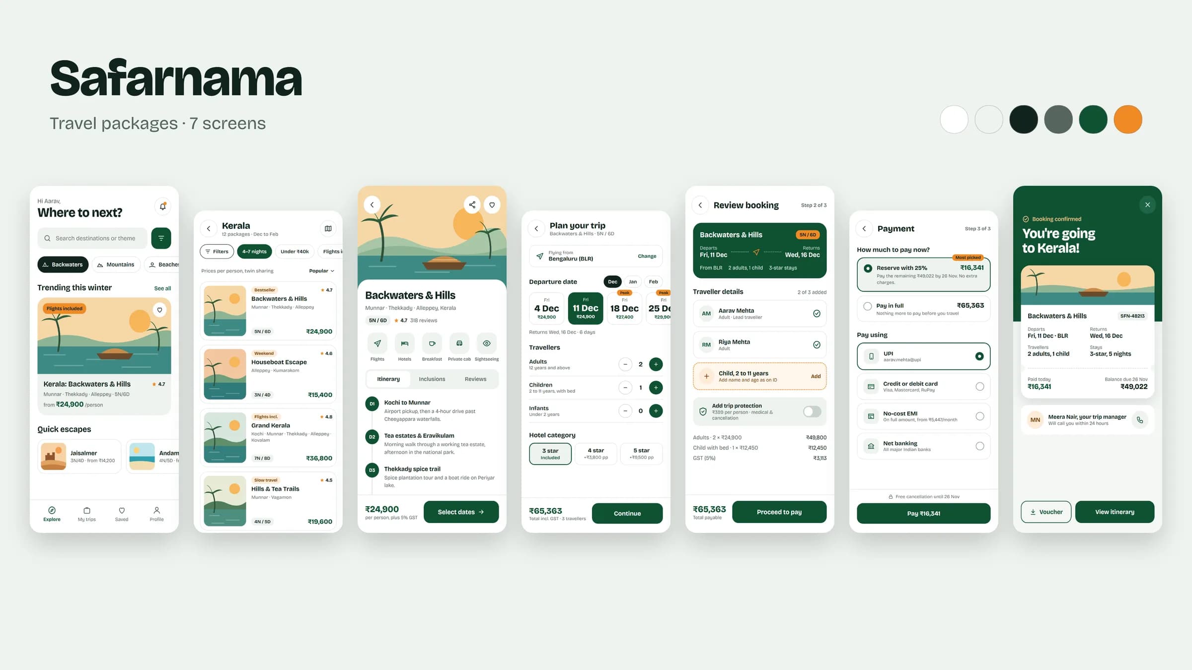
The app, screen by screen
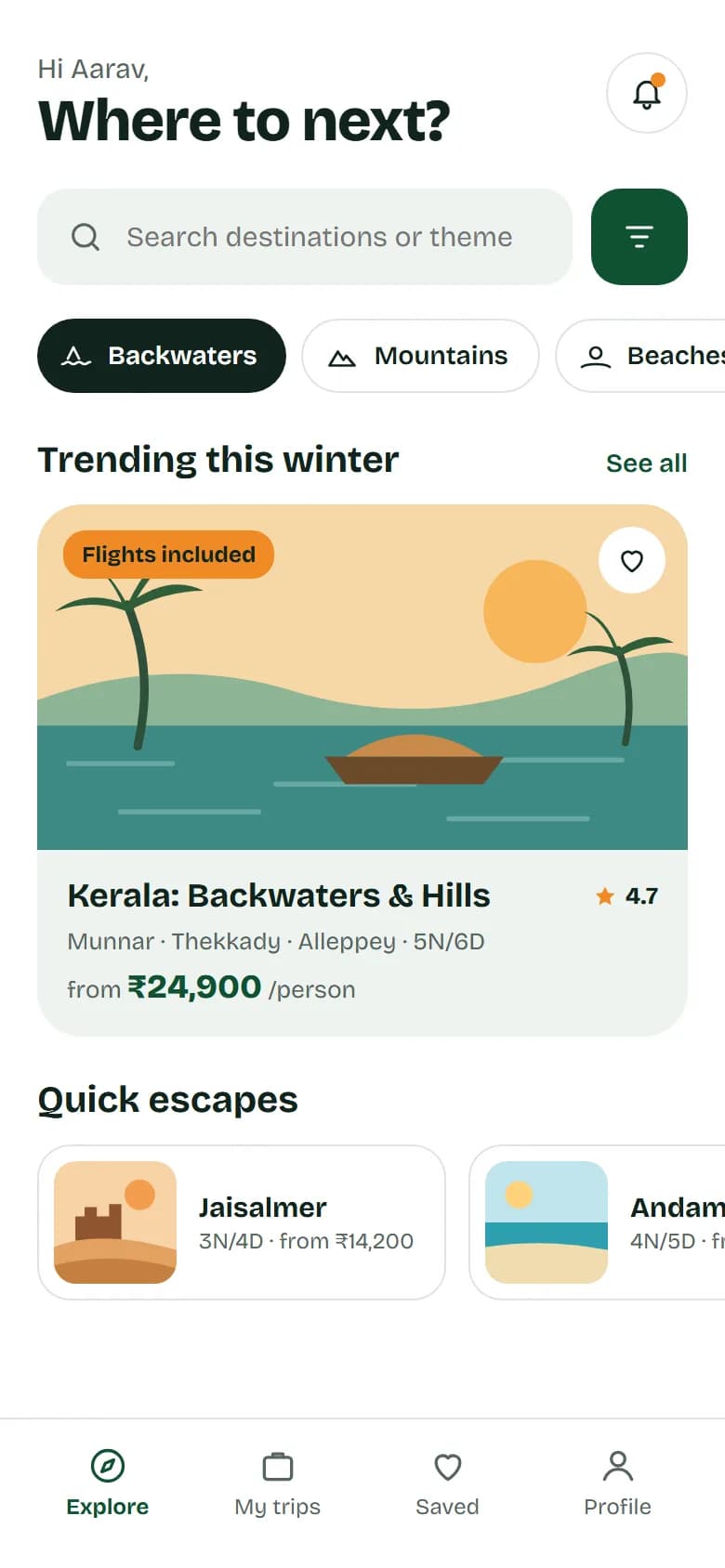
01Home 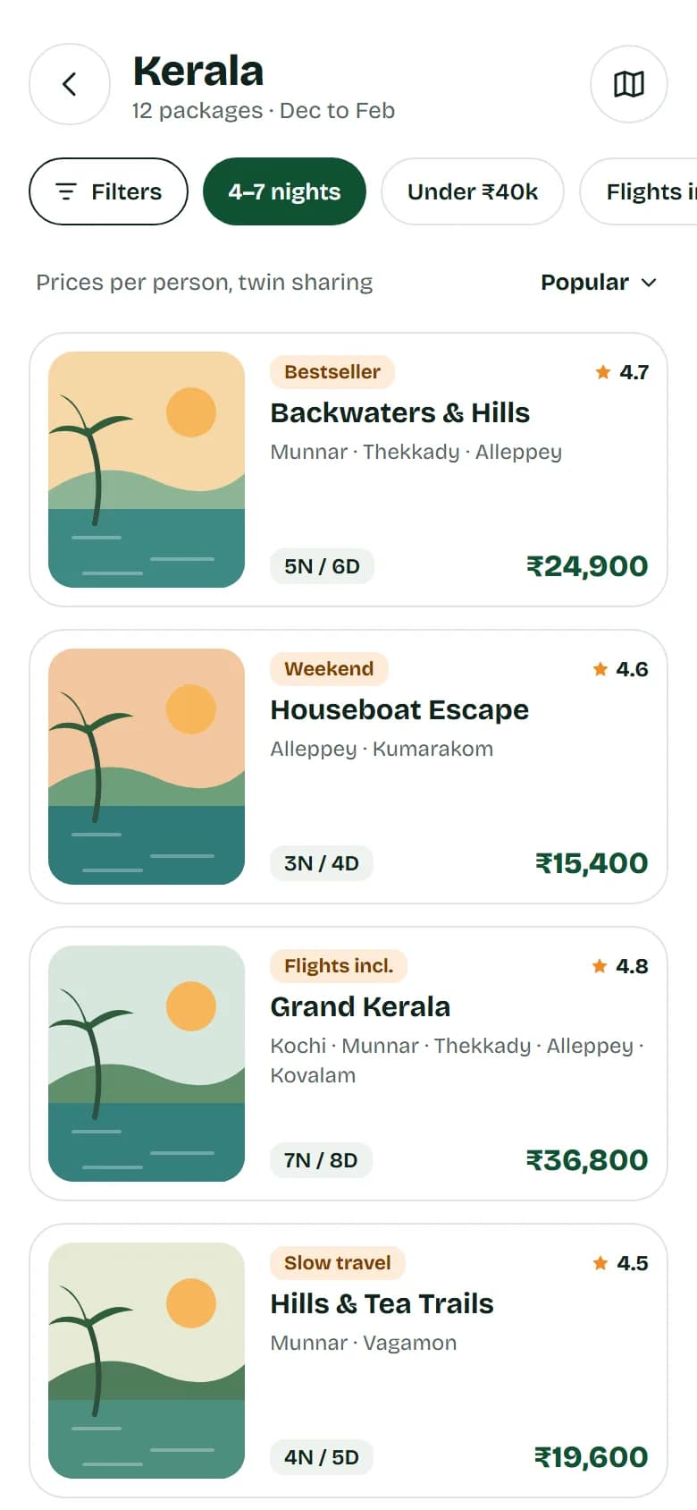
02Packages 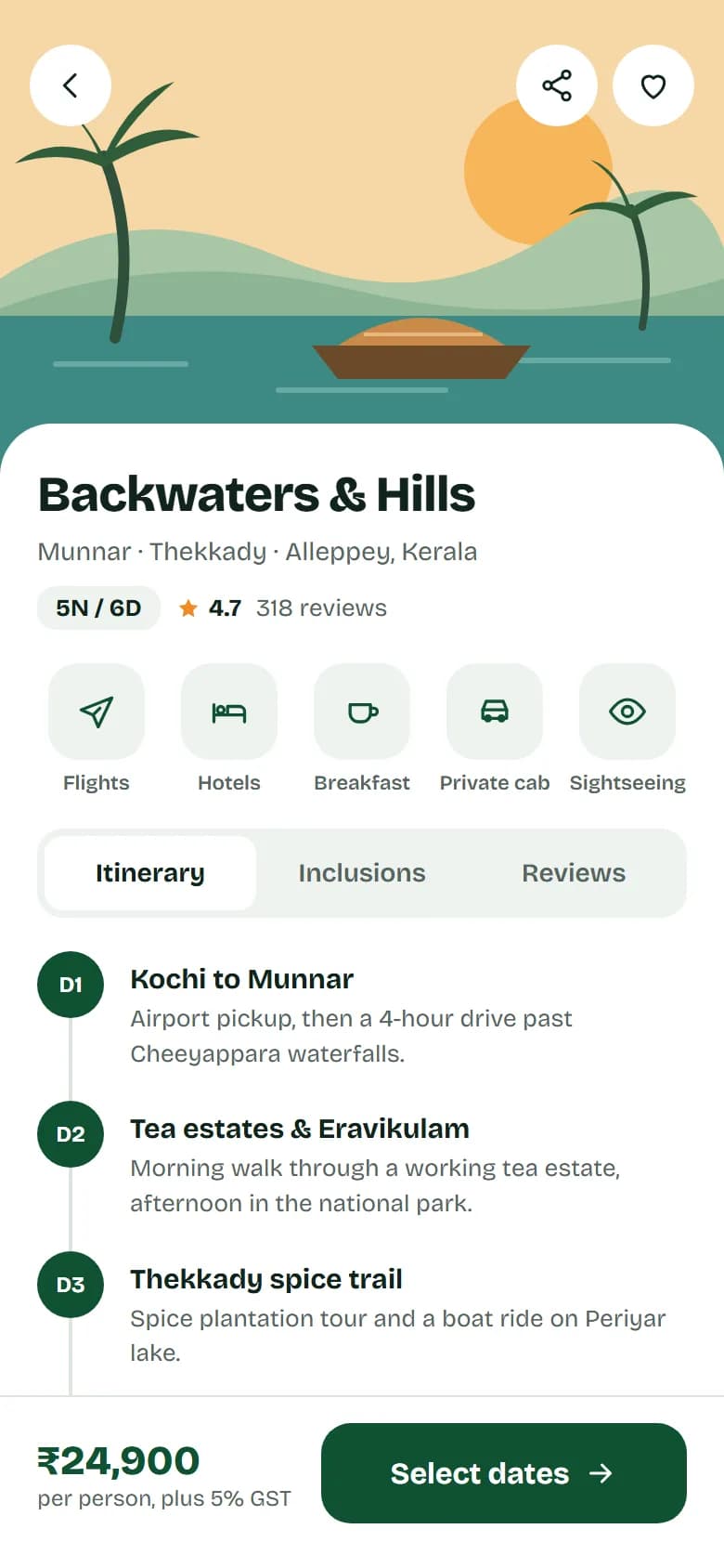
03Package detail 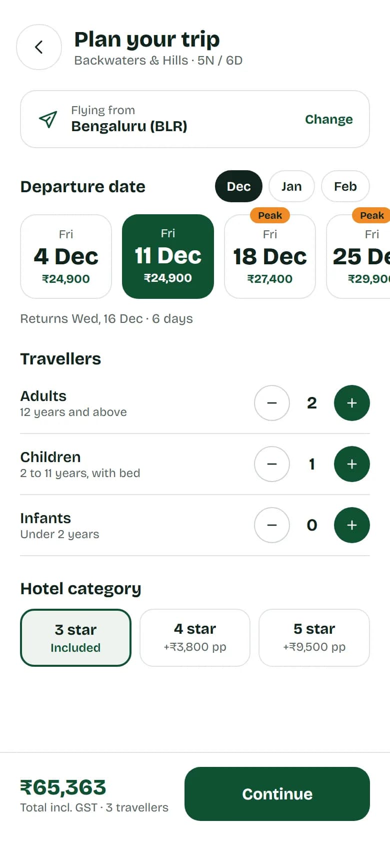
04Dates and travellers 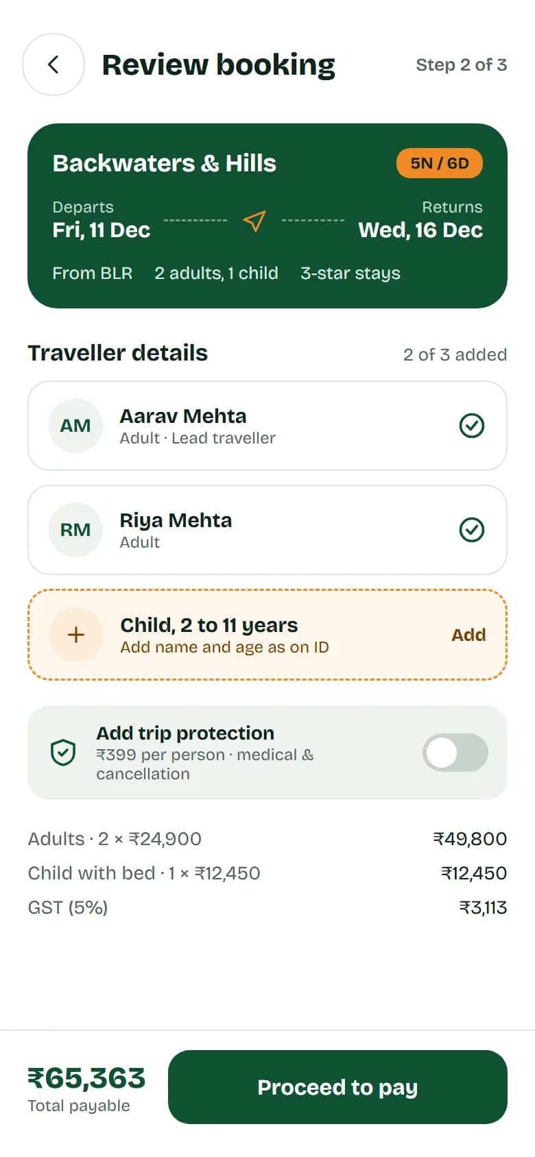
05Review booking 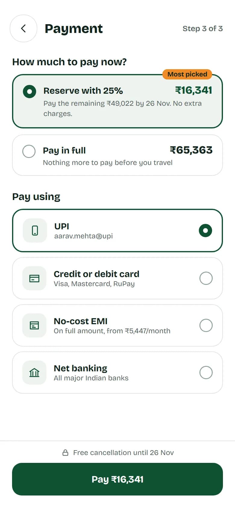
06Payment 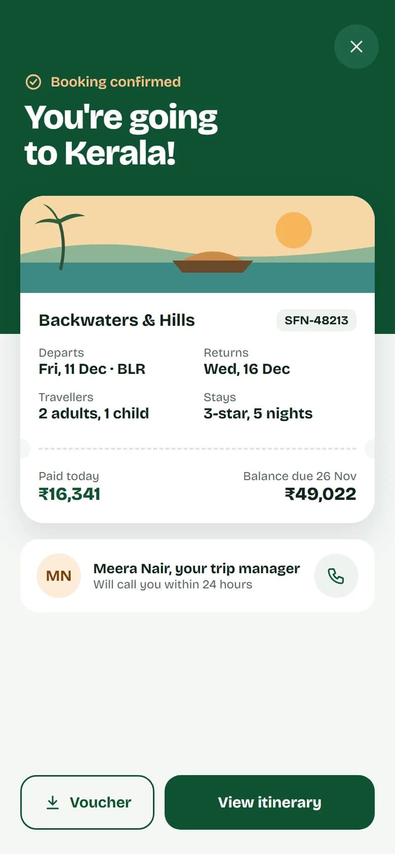
07Booking confirmed
Flow · Home → Packages → Package detail → Dates and travellers → Review booking → Payment → Booking confirmed
The idea
An app design for a fictional travel company. A ₹65,000 holiday is a big decision, so the app has to earn trust at every step before it asks for money.
Our approach
Deep green for trust, orange only for offers and peak dates, and flat illustrated scenes in place of destination photography. Seven screens run from home through packages, the day-by-day itinerary, dates and travellers, and review to payment and the confirmed booking.
Key decisions
Prices on the dates
Departure dates are cards with the price on each, and peak dates are flagged before anyone picks one.
Fixed before pay, not after
Review booking marks the one missing traveller in orange, instead of showing an error after the pay button is pressed.
A deposit that suits the price
Payment offers a 25% deposit with the balance date stated, so a large trip can be reserved today.
Palette and type
- Ground#FFFFFF · Screen background
- Surface#EEF3EF · Search field, tiles, tabs
- Ink#10231C · Type
- Muted text#55655E · Secondary text
- Primary#0F5132 · Buttons, prices, selected states
- Accent#F08A24 · Offer and peak badges
Type · Bricolage Grotesque